
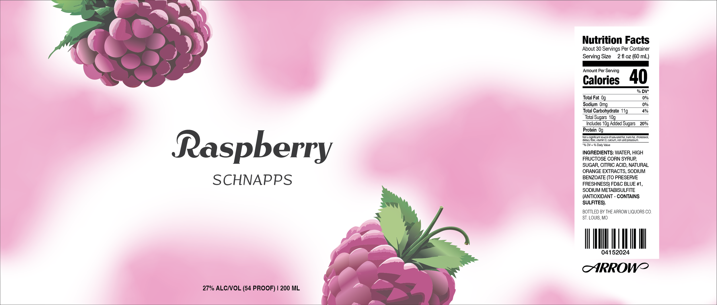
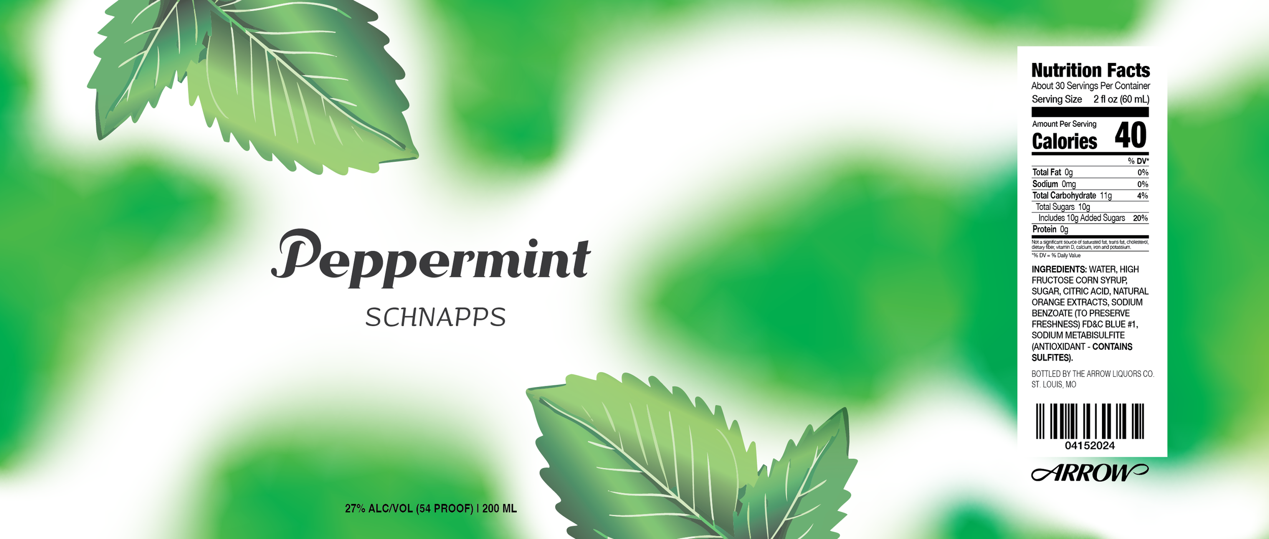
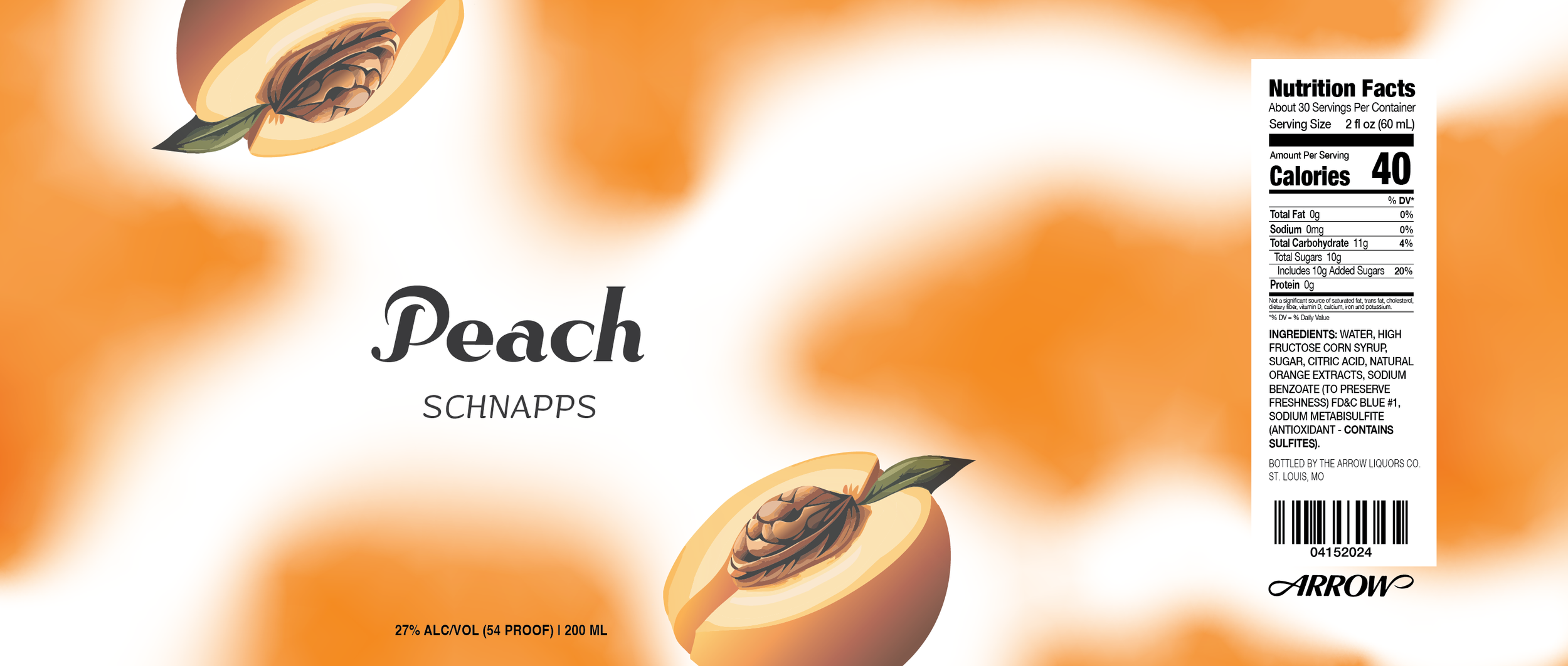
Schnapps Redesign - Packaging Design
This was a packaging redesign I did for Arrow’s Schnapp’s brand. I used Adobe Illustrator to design a new color palette, logo, and color scheme to make it feel like the different flavors were each their own product but could also flow together on a shelf.
I started by walking through the liquor store and picking out a little bland product. Arrow stood out to me. Schnapps are very fun; they’re used to spice up a recipe or make seasonal or holiday drinks. The packaging on them made it look like it was just another alcohol. I wanted to avoid the half-label and try to make it fun. I dyed the bottles to match the flavor of the liquid and used a fun wrap-around gradient to give the bottles a revamped and modern feel. This was a fun project; printing out and placing the stickers on the bottle was engaging and exciting! It made me passionate about packaging design, which I would potentially want to pursue.

Check out my thought process and inspiration!


